Web Design 101: Decoding the Anatomy of a Successful Website
Ever felt overwhelmed while trying to design a website? In today’s digital age, an effectively structured and designed website is crucial for any business. This article demystifies the complexity of “website anatomy”, breaking down the essential elements that make up a web page, their importance and how to implement them effectively.
Key Takeaways
- The header of a website is the first point of interaction for users and contributes significantly to user experience and brand recognition.
- The CTA button is a crucial element that serves as the gateway for users to take desired actions on your website, increasing conversion rates and driving business goals.
- The hero section is the first thing users see when they visit your site and should be visually appealing with a clear headline to engage visitors.
- The footer provides additional information and navigational links at the bottom of a web page, enhancing user experience and making it easier for visitors to find what they are looking for.
Essential Elements of a Web Page
The header, CTA button, hero section, footer, slider, search bar, menu, breadcrumbs, form, cards, video content, progress indicator and favicon are all crucial elements of a well-designed web page.
Header
The header of a website serves as the first point of interaction for users. It often contains essential elements like the company logo, navigation menu, and sometimes a search bar.
A well-designed header contributes significantly to user experience by offering straightforward site navigation. Furthermore, it works as an invaluable branding tool since it’s consistently visible on all web pages, reinforcing brand recognition among visitors.
CTA Button
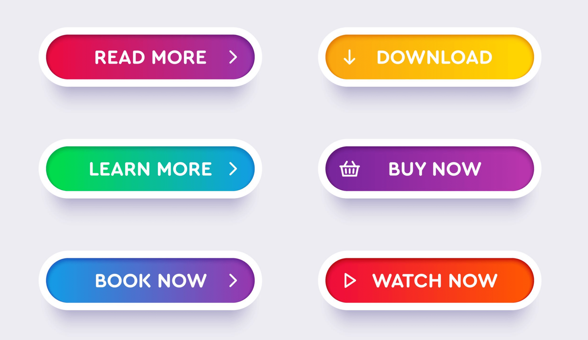
The CTA button, or Call-to-Action button, is a crucial element of a web page. It serves as the gateway for users to take a desired action on your website, such as making a purchase, subscribing to a newsletter, or signing up for a service.
The CTA button should be strategically placed in a prominent location and designed in an eye-catching way to attract attention. By using persuasive language and clear instructions, you can guide users towards the action you want them to take.
Effective CTAs can significantly increase conversion rates and help drive business goals.
In order to create high-performing CTAs, it’s important to consider factors such as color contrast against the background, size and placement on the page, wording that creates urgency or excitement, and overall usability.
Testing different variations of your CTA buttons through A/B testing can also help optimize their performance. Remember that each web page should have its own unique CTA button tailored to its specific goal or objective.
Hero Section
The hero section of a website is the first thing users see when they visit your site. It typically includes a large, attention-grabbing image or video, along with a clear and concise headline that communicates the main message of your website.
The hero section serves as an introduction to your brand and sets the tone for the rest of the site. It should be visually appealing and capture visitors’ attention immediately, encouraging them to explore further.
Including a strong call-to-action button in this section can also help guide users towards taking desired actions on your website. By creating an impactful hero section, you can effectively engage visitors and leave a lasting impression.
Footer
The footer is an important element of a web page that is typically located at the bottom. It provides additional information and navigational links to users, allowing them to easily access important pages such as the privacy policy, terms and conditions, and contact information.
The footer also often contains social media icons for easy sharing and can include copyright information or site maps. By including a well-designed footer on your website, you can enhance user experience and make it easier for visitors to find what they are looking for without having to scroll back up the page.
Slider
A slider is a dynamic element that allows you to display multiple images or pieces of content in a single area on your website. It adds visual interest and engagement to your web page, making it more appealing to visitors.
Sliders are often used on homepage banners or as featured elements within a webpage. By using a slider, you can showcase different products, promotions, or important messages in an interactive and eye-catching way.
With its ability to transition between different slides automatically or with user interaction, the slider is an effective tool for capturing attention and conveying information quickly.
Search
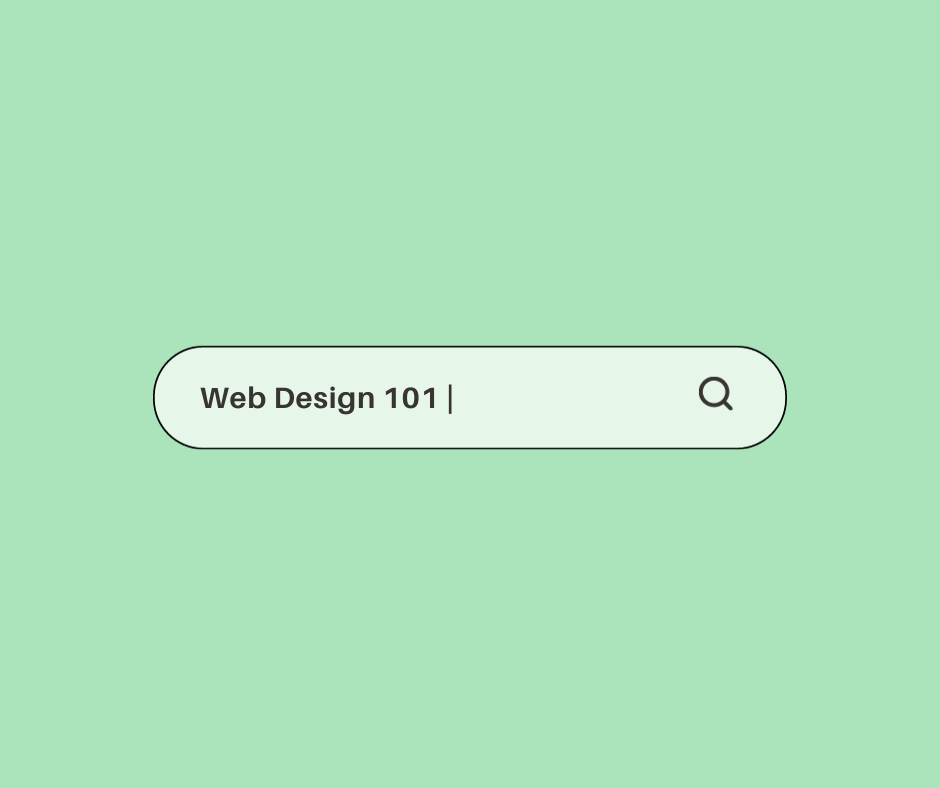
Search functionality is a crucial element of any website. It allows users to find specific information or products quickly and easily. With the help of a search bar, visitors can enter keywords or phrases related to what they are looking for.
The website then displays relevant results, making it convenient for users to navigate through the site and locate the desired content. Implementing an effective search feature enhances user experience and increases engagement on your website.
Make sure that your search function is prominently placed and provides accurate results, ensuring that visitors can find what they need efficiently.
Menu
The menu is a crucial element of a web page that provides users with easy navigation throughout the website. It typically appears at the top or side of the page and contains a list of clickable links to various sections or pages on the site.
The menu allows visitors to quickly find and access different parts of the website, making it convenient for them to explore and gather information. With an intuitive and well-designed menu, users can easily navigate through your website, enhancing their overall user experience and helping them find what they’re looking for efficiently.
Breadcrumbs
Breadcrumbs are a useful navigational tool that helps users understand their current location within a website. They are typically displayed near the top of a web page and show the path that users have taken to arrive at their current page.
Breadcrumbs consist of clickable links, starting with the homepage and progressively showing each level of navigation. This feature enhances usability by allowing users to quickly navigate back to previous pages or higher-level sections of the website with just a single click.
Breadcrumbs also provide context for users, helping them better understand where they are in relation to the overall site structure. Whether it’s an e-commerce store or a content-heavy website, incorporating breadcrumbs into your design can improve user experience and make navigation more intuitive.
Form
Forms are an essential element of a web page that allows users to interact and provide information. They can be used for various purposes, such as signing up for newsletters, making purchases, or submitting inquiries.
A well-designed form should be user-friendly and easy to fill out, with clear instructions and error messages if needed. It is crucial to keep the form fields concise and relevant to avoid overwhelming users.
By incorporating forms into your website architecture effectively, you can enhance user engagement and collect valuable data from your visitors.
Cards
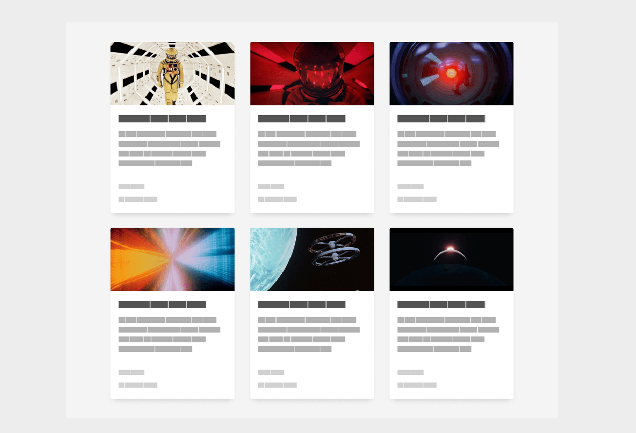
Cards are a popular web design element that can be found on many websites today. These small rectangular containers are used to present information or content in a visually appealing and organized manner.
Cards typically include an image or graphic, along with a title, brief description, and sometimes additional details or links. They can be stacked or arranged side by side to create a grid-like layout.
The main advantage of using cards is that they allow for easy scanning and navigation, making it simple for users to find the information they need quickly. With their clean and modern look, cards have become an essential part of website design, helping to enhance user experience and engagement.
In addition to their visual appeal, cards also offer flexibility in terms of content presentation. They can display anything from blog posts and product listings to event announcements and social media updates.
This versatility makes them suitable for various industries, from e-commerce sites showcasing products to news outlets highlighting articles. By using cards effectively on your website, you can grab users’ attention and provide them with bite-sized pieces of information that are easy to digest.
Video
Video is a powerful element that can enhance the overall user experience on a website. It allows businesses to engage with their audience through visual storytelling and helps convey information in a more dynamic and interactive way.
Whether it’s a product demo, tutorial, or promotional video, incorporating videos into your web pages can capture attention and maintain interest. Videos also have the potential to boost SEO by increasing time spent on your site.
By incorporating relevant keywords in video titles, descriptions, and tags, you can improve your website’s visibility in search engine results. Additionally, embedding videos from popular platforms like YouTube or Vimeo makes it easier for visitors to view and share your content across different channels.
Progress Indicator
A progress indicator is a visual element on a web page that shows the user how far they are in completing a task or process. It provides feedback and helps to keep users informed about the progress they have made.
By displaying relevant information, such as percentage or step-by-step updates, a progress indicator enhances the user experience by reducing uncertainty and increasing engagement.
With an active role in guiding users through complex tasks like form submissions or multi-step processes, progress indicators contribute to seamless navigation and efficient interactions on websites.
Favicon
A favicon, short for favorite icon, is a small icon that appears next to the web page title in the browser tab. It serves as a visual representation of your website and helps users identify your site among multiple tabs.
Favicon images are usually square-shaped and can be created using software or online generators. By adding a favicon to your website, you can enhance the overall user experience and make your site look more professional and branded.
Tags
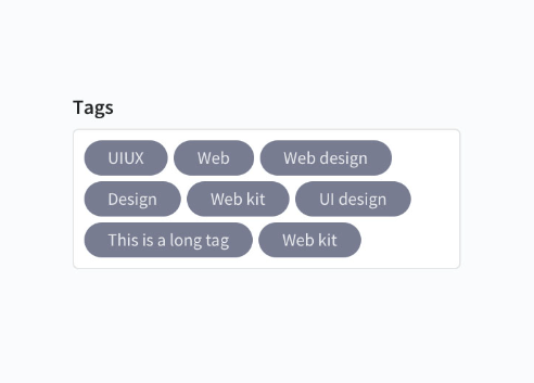
Tags play a crucial role in organizing and categorizing content on a website. They act as labels that help users easily navigate through different topics or types of information. By using tags, website owners can enhance the user experience by providing an efficient way for visitors to find specific content they are interested in.
Tags also help search engines understand the relevance and context of web pages, which can improve a website’s visibility in search results. When implemented correctly, tags contribute to better overall site navigation and make it easier for both users and search engines to understand the structure and organization of a website’s content.
In terms of implementation, tags should be concise and descriptive so that users can quickly determine what kind of information each tag represents. It is important to use consistent tagging conventions across the website to maintain clarity and avoid confusion.
Build websites easily with various Website Builder Software. Find more here.
Importance of Website Architecture
Website architecture plays a crucial role in organizing and structuring a website, ensuring easy navigation, clear content hierarchy, and optimal user experience.
Information architecture
Information architecture is a crucial aspect of website design that focuses on organizing and structuring content in a way that makes it easy for users to navigate and find what they need.
It involves deciding how information should be categorized, labeled, and presented to ensure a seamless user experience. By carefully planning the information architecture of a website, businesses can enhance usability, improve search engine optimization (SEO), and ultimately attract and retain more visitors.
Effective information architecture ensures that users can quickly locate desired information without feeling overwhelmed or lost within the website’s structure. This leads to better engagement, conversions, and overall satisfaction for users.
Website architecture
Website architecture refers to the structure and organization of a website. It encompasses how all the different components, such as content, navigation, and visual design, are arranged and connected to create a cohesive user experience.
A well-designed website architecture helps users easily find information they need and navigate through pages seamlessly. It also plays a crucial role in search engine optimization (SEO) by ensuring that search engines can crawl and index your site effectively.
By following best practices in website architecture, you can create a high-performing website that engages users and drives conversions.
Schemas and Document type definition
Schemas and Document Type Definition (DTD) are crucial components of website architecture. A schema is a blueprint or framework that defines the structure and organization of data on a web page.
It provides guidelines for how different elements should be structured, allowing search engines to understand and interpret the content more accurately. Similarly, DTD defines the specific rules and syntax for a particular markup language like HTML or XML.
By using schemas and DTDs, web developers can ensure consistency in their code, making it easier to maintain and update websites. These tools help create well-structured pages with clear hierarchies, improving both user experience and search engine optimization (SEO).
Structural markup of a website
Structural markup is an essential component of website design that helps organize and structure the content on a web page. It involves using HTML tags to identify different sections of a webpage, such as headings, paragraphs, lists, and images.
By applying structural markup correctly, developers can ensure that search engines and screen readers understand the hierarchy and relationships between different elements on the page.
This not only improves accessibility but also makes it easier for users to navigate and understand the content. So, whether you’re building a blog or an eCommerce site, incorporating proper structural markup is crucial for creating a well-organized and user-friendly website experience.
Components and scripting
Components and scripting play a crucial role in website architecture. Components refer to the different elements that make up a web page, such as forms, cards, videos, and progress indicators.
These components help organize and present information effectively to users. On the other hand, scripting involves using programming languages like HTML, CSS, and JavaScript to add interactivity to the website.
By incorporating components and scripting into your website design, you can enhance user engagement and create a more dynamic online experience for visitors.
The web browser
The web browser is a crucial component of website architecture as it serves as the interface between the user and the internet. It allows users to access and navigate websites by interpreting HTML, CSS, and other programming languages used to build web pages.
Through the web browser, users can view content, interact with forms or buttons, watch videos, and browse through different pages on a website. Browsers also provide important functionalities like bookmarking pages, saving passwords, and managing cookies.
Without a reliable web browser, websites would not be accessible or functional for users.
Content
Content is a crucial element of any web page. It refers to the text, images, videos, and other media that make up the information presented on a website. Well-structured and engaging content plays a vital role in attracting and retaining visitors.
It should be concise, relevant, and easy to understand. High-quality content helps to communicate your message effectively and drives user engagement. By incorporating keywords strategically, you can also improve your website’s search engine ranking.
Remember to keep your content updated regularly to ensure its accuracy and relevance for your audience.
In addition to textual content, visual elements like images and videos are essential for capturing users’ attention quickly. Visuals can enhance the overall look of a webpage while also conveying information efficiently.
Use high-resolution product images or eye-catching graphics that align with your brand identity. Videos can provide engaging demonstrations or explanations about products or services offered on your website.

Navigation
The navigation of a website plays a crucial role in helping users find information quickly and easily. It typically includes menus, links, and search bars that allow visitors to explore different sections of the site.
A well-designed navigation system ensures that users can navigate between pages effortlessly, improving their overall browsing experience. By organizing content into logical categories and using descriptive labels for menu items, websites can make it easier for users to locate the information they are seeking.
Effective navigation promotes engagement and enhances user satisfaction, ultimately leading to higher conversion rates on a website.
Visual and web design
Visual and web design play a crucial role in creating an engaging and effective website. The visual elements of a website, such as color schemes, typography, and images, help to establish the overall look and feel of the site.
This not only contributes to a visually appealing design but also enhances user experience by guiding visitors’ attention to important information. Additionally, web design focuses on usability by ensuring that the layout is intuitive and easy to navigate.
By incorporating responsive design techniques, websites can adapt seamlessly across different devices, providing users with a consistent experience no matter how they access the site.
Website Architecture Best Practices
Create a simple top-level navigation to ensure easy and intuitive browsing for users.
Create a simple top-level navigation
Creating a simple top-level navigation is crucial for an effective website architecture. This refers to the main menu that appears at the top of every page, allowing users to easily navigate through different sections of your site.
By keeping it simple and intuitive, you can enhance the user experience and make it easier for visitors to find what they’re looking for. Use clear and concise labels for each menu item, ensuring they accurately represent the content or services they link to.
Avoid cluttering the navigation with too many options – stick to the most important pages or categories. Additionally, consider using drop-down menus if necessary to organize subpages within broader sections.
Overall, well-designed top-level navigation helps improve usability and ensures visitors can quickly access the information they need on your website.
Improve your website’s architecture with UXtweak by analyzing how users interact with your current navigation system and identifying any pain points or areas where improvements can be made.
Improve your website’s architecture with UXtweak
Improve your website’s architecture with UXtweak. By using UXtweak, you can optimize the structure and design of your website to enhance user experience. This powerful tool allows you to analyze user behavior, gather insights through heatmaps and session recordings, and make data-driven decisions to improve site navigation, content organization, and overall functionality.
With UXtweak, you can ensure that your website is visually appealing, easy to navigate, and optimized for high performance.
Website architecture diagram
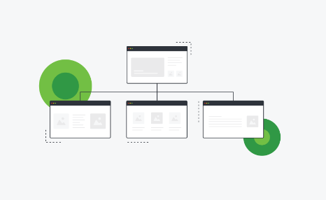
A website architecture diagram is a visual representation of the structure and organization of a website. It provides a clear overview of how different pages, sections, and components are connected to each other.
By using boxes or shapes to represent each page or component and lines to illustrate their relationships, the diagram helps developers and designers understand how information flows on the site.
This can be particularly useful when planning or redesigning a website, as it allows for efficient decision-making regarding content hierarchy, navigation menus, and user flow. A well-designed website architecture diagram ensures that users can easily navigate through the site and find what they need quickly.
Conclusion
Understanding the anatomy of a website is crucial for creating a high-performing and user-friendly web page. From the header to the footer, each element plays a vital role in organizing content, guiding navigation, and enhancing visual appeal.
By implementing effective website architecture and design principles, you can optimize your site’s functionality and provide an exceptional user experience for visitors. So take the time to analyze your website’s structure and ensure that every component works together seamlessly.
Frequently Asked Questions
What is website anatomy?
Website anatomy refers to the structure or layout of a web page, which includes elements like header design, footer design, and website navigation.
What are some important components in website anatomy?
Some key components in website anatomy include webpage elements such as headers and footers, page hierarchy for easy navigation, and functionality aspects managed through a content management system.
How can understanding website anatomy help improve my site?
Understanding website anatomy helps you create a high-performing website by optimizing its design elements for better usability and overall user experience.
Can website optimization be influenced by the web page’s anatomy?
Absolutely! A well-structured web page with optimal use of its anatomical features enhances user engagement and experiences leading to improved search engine rankings.


